Manual in PDF format
1. Basic information
1.1. Description of the control
Planner is a multi-source planning calendar.
1.2. Create a new control
A new planner can be created as follows from the view page using the toolbar with controls:
- First, click on the view page to determine the position in which the new planner should be placed. This will highlight the selected position with a gray horizontal line. Then just click on the “Planner” item in the toolbar of the view page, fill in the attributes of the new control in the newly opened dialog, and then save. This will insert a new planner at a pre-selected location on the view page.
- If the required position is not determined before inserting the new planner, the new planner will be inserted at the end of the view page.
1.3. Edit or delete a control
- For each existing control, a pencil icon appears to the left of the control page to change or delete the control's settings.
- Individual controls can be moved vertically on the view page using the Drag&Drop method. Moving consists of grabbing the control, preferably behind its name, and then dragging it to the desired location on the view page.
- For security reasons, it is important to have the function of moving controls enabled using the “Drag&Drop” check box located above the toolbar with controls. This field is unchecked each time you log in to the application.
2. List of tabs in the control settings dialog
- General – Setting general properties
- Resources – Setting up scheduling calendar resources
- Availabilities – Availability settings
- Text – Setting the columns displayed in the planning calendar
- Tooltip – Settings for columns displayed in details
- Rights – Rights settings
- Administration – Setting other properties
2.1. “General” tab
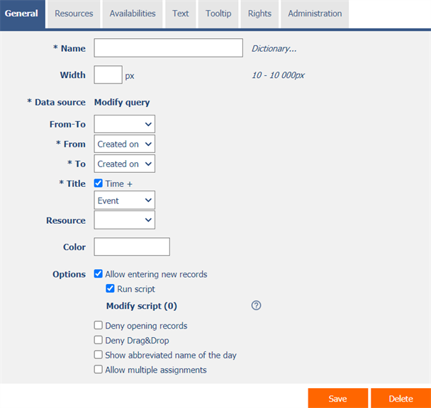
2.1.1. Name
- The name of the control displayed in the header of the planning calendar.
2.1.2. Dictionary
- The dictionary lists the names of other controls, forms, view pages, categories, applications, and application groups used across the entire application.
- The dictionary search is used to design the correct control name and to maintain the consistency of the nomenclature throughout the application so that controls with the same meaning located in different places in the application are named in the same way.
2.1.3. Width
- The width of the control, expressed in pixels.
- If you do not fill in this input field, the width of the planning calendar will be set to the maximum screen width.
2.1.4. Data source
- The data source defines the source database records displayed in the planning calendar.
- Data source settings are made in the graphical designer of database queries. A detailed description of the database query designer is provided in the separate “Database Query Designer” guide.
2.1.5. From-To
- Select a column that determines whether the event in the planning calendar is one-day/multi-day.
2.1.6. From
- Select a column that specifies the start date of the event in the planning calendar.
2.1.7. To
- Select a column that specifies the end date of the event in the planning calendar.
2.1.8. Title
- Select a column that specifies the title of the event in the planning calendar.
- Time – Checking this box determines whether the event time stamp should be displayed in the format “HH: mm” in addition to the title.
2.1.9. Resource
- Select a column that specifies the source of the event in the planning calendar.
- Resources are displayed as individual columns of the planning calendar.
2.1.10. Color
- Default color of all events in the planning calendar.
- Each event can have its own color set. In the data source settings, the “Color by” column must be set, according to which the color of the event is determined.
2.1.11. Options
- Allow entering new records
- Checking this box determines whether the user should be allowed to be redirected to a specific edit form in order to create a new record in the database. by clicking on a free space in the cell of the planning calendar.
- Run script
- Checking this box determines whether a script should be run before entering the edit form to create a new record in the database, which typically plans to populate other values using the “SCHEDULEDEFAULTVALUE” or “SCHEDULEDEFAULTVALUES” server function. A detailed description of the server functions is given in the separate “Server Functions” manual.
- The following variables can be used in the script. A detailed description of the variables is given in a separate manual “Variables”.
- #planners#
- #plannerresource#
- #plannerresourcefrom#
- #plannerresourceto#
- #plannerto#
- Deny opening records
- Checking this box determines whether all users should be denied access to the edit form in order to open the displayed database record by clicking on an event in the planning calendar.
- Deny Drag&Drop
- Checking this box determines whether drag&Drop calendar calendar events should be disabled.
- Show abbreviated name of the day
- Checking this box determines whether the abbreviated name of the day should be displayed in the lines of the planning calendar along with the date of the day.
- Allow multiple assignments
- Checking this box determines whether a text box or a drop-down list with the selected value should be displayed in the planning calendar instead of the control value itself, with the option to change the value without having to open and edit the record in the edit form.
- This function is applied only to controls that have the “Allow multiple assignments” check box selected on the “General” tab.
- Bulk changes can only be made by a logged-in user, a text box or a read-only drop-down list is displayed to an anonymous user.
- Checking this box determines whether a text box or a drop-down list with the selected value should be displayed in the planning calendar instead of the control value itself, with the option to change the value without having to open and edit the record in the edit form.
2.2. “Resources” tab
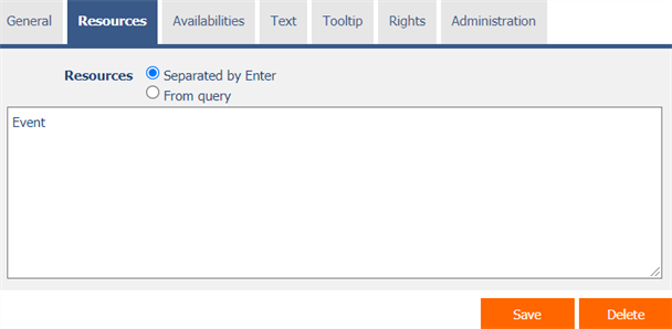

2.2.1. Resources
- Definition of resources that appear as individual columns of the planning calendar.
- The source radio button contains the following two types of source definition:
- Separated by Enter - the list of source values is set manually, in the text field using values separated by enter
- From query – the list of resources defines a database query, which is evaluated when opening or updating the view page
2.2.2. Save resource ID to the database
- Checking this box determines whether the database event records have a foreign key value stored in the resource value that references the primary key of the resource.
2.3. “Availabilities” tab
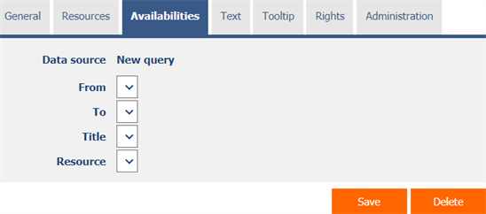
- Availability definitions that determine the background color of individual planning calendar cells.
- Availability visually highlights the days when it is possible to schedule a new event. Available days have a gray background, unavailable days have a white background.
2.3.1. Data source
- The data source defines the source database availability records in the planning calendar.
- Data source settings are made in the graphical designer of database queries. A detailed description of the database query designer is provided in the separate “Database Query Designer” guide.
2.3.2. From
- Select a column that specifies the start date of availability in the planning calendar.
2.3.3. To
- Select a column that specifies the end date of availability in the planning calendar.
2.3.4. Title
- A column selection that specifies the availability title in the planning calendar, displayed as a tooltip over a given day and resource.
2.3.5. Resource
- Select a column that specifies the source of availability in the planning calendar – the source for which availability is intended.
2.4. “Text” tab
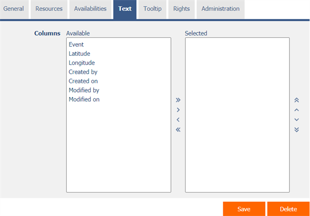
2.4.1. Columns
- Definition of the columns displayed in the planning calendar event text box.
2.5. “Tooltip” tab
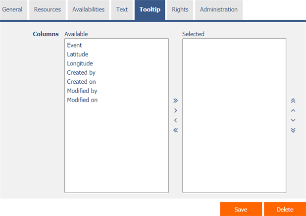
2.5.1. Columns
- Definition of the columns of details displayed when hovering the mouse over a planning calendar event.
2.6. “Rights” tab
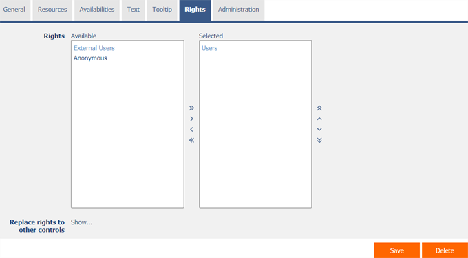
2.6.1. Rights
- Rights define a list of user groups and users who have permission to display the control on the view page.
2.6.2. Replace rights to other controls
- The “Replace rights to other controls” feature is used to unify rights across the entire view page for controls that are related in terms of rights.
- Thanks to the “Show…” link, it is possible to display a list of all controls on the view page, including the setting of the rights of these controls. For each control, a check box is displayed that allows you to select the control. When you save a control, the same rights are then set for those selected controls.
- An alternative for unifying rights within the entire view page is to display the report available from the “Subordinate object rights” tab in the view page settings.
2.7. “Administration” tab

- The “Administration” tab is only displayed for existing controls.
2.7.1. Location
- Select the view page on which the control is located.
- The drop-down list contains all view pages located in the same application.
