Manual in PDF format
1. Basic information
1.1. Description of the control
LiteDataGrid is a view table that displays database records retrieved by a query from a database, without the possibility of personalization, search and filtering records, and without the ability to export and import data.
1.2. Create a new control
New litedatagrid can be created as follows from the edit form using the toolbar with controls:
- First, the position in which the new litedatagrid is to be placed is determined by clicking the mouse in the edit form. This will highlight the selected position with a gray horizontal line. Then just click on the item “LiteDataGrid” in the toolbar of the edit form, fill in the attributes of the new control in the newly opened dialog, and then save. This will insert a new litedatagrid in the pre-selected location of the edit form.
- If the required position is not determined before inserting a new tab, the new LiteDataGrid will be inserted at the end of the edit form.
1.3. Edit or delete a control
- For each existing control, a pencil icon appears on the left side of the edit form to change or delete the control's settings.
- Individual controls can be moved vertically in the edit form using the Drag&Drop method. Moving consists of grabbing the control, preferably behind its name located in the left column of the edit form, and then dragging it to the desired position in the edit form.
- For security reasons, it is important to have the function of moving controls enabled using the “Drag&Drop” check box located above the toolbar with controls. This field is unchecked each time you log in to the application.
2. List of tabs in the control settings dialog
- General – Setting general properties
- View table – View table column settings
- Search – Search settings
- Help – Help text settings
- Rights – Rights settings
- Administration – Setting other properties
2.1. “General” tab
2.1.1. Common question
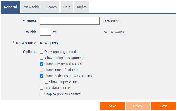
2.1.2. Name
- The name of the control displayed in the header of the view table.
- Placing the control name between the two bytes ensures that the view table is completely hidden if no record is the result of the query – for example, “|Records in the Book table|“.
- The right side can be followed by alternative HTML code, which will be displayed instead of the view table if no record is the result of the query – for example “|Records in the Book|<img src="Images/Help.gif">“.
2.1.3. Dictionary
- The dictionary lists the names of other controls, forms, view pages, categories, applications, and application groups used across the entire application.
- The dictionary search is used to design the correct control name and to maintain the consistency of the nomenclature throughout the application so that controls with the same meaning located in different places in the application are named in the same way.
2.1.4. Width
- The width of the control, expressed in pixels.
- If this input field is not filled in, the width of the view table will be determined automatically by the web browser.
2.1.5. Data source
- The data source defines the source database records displayed in the view table.
- Data source settings are made in the graphical designer of database queries. A detailed description of the database query designer is provided in the separate “Database Query Designer” guide.
2.1.6. Options
- Deny opening records
- Checking this box determines whether all users should be denied access to the edit form to open the displayed database record using the pencil icon that appears at the beginning of each row of the view table.
- Allow multiple assignments
- Checking this box determines whether a text box or drop-down list with the selected value should be displayed in the view table instead of the control value itself, with the option to change the value without opening and editing the record in the edit form.
- This function is applied only to controls that have the “Allow multiple assignments” check box selected on the “General” tab.
- Multiple assignments can only be made by a logged-in user, a text box or a read-only drop-down list is displayed to the anonymous user.
- Checking this box determines whether a text box or drop-down list with the selected value should be displayed in the view table instead of the control value itself, with the option to change the value without opening and editing the record in the edit form.
- Show only nested records
- Checking this box determines whether the “PID = ID record in form” constraint should be automatically appended to the database query definition.
- Show sums of columns
- Checking this box determines whether a row with the sum of the values of the individual columns should be displayed in the footer of the view table.
- This function is applied only to TextBox controls of numeric data types that do not have the “Hide column total in view table” check box selected on the “General” tab.
- Show as details in two columns
- Checking this box determines whether the values should be displayed as a two-column table with the column name in the first column and the value in the second column, instead of the normal table method.
- Show empty values
- Checking this box determines whether columns with an empty value should be displayed in plain text mode.
- Hide data source
- Checking this box determines whether the contents of the view table should be automatically hidden when the edit form is opened. Database records will not be displayed to the user until the “View” icon is clicked.
- Snap to previous control
- Checking this box determines whether the control itself should be displayed to the right of the previous one in the edit form, or whether it will be displayed below the previous control in the usual way.
2.1.7. Aggregation query without grouping by date

- Show sums of columns
- Checking this box determines whether a row with the sum of the values of the individual columns should be displayed in the footer of the view table.
- This function is applied only to columns that do not use the command to hide the sum of the column using the syntax “Column@-sum”. A detailed description of the syntax of column names is given in the separate “Administrator's Guide”.
- Snap to previous control
- Checking this box determines whether the control itself should be displayed to the right of the previous one in the edit form, or whether it will be displayed below the previous control in the usual way.
2.1.8. Aggregation query with grouping by date

- Fill time gaps
- Checking this box determines whether time continuity should be ensured in the resulting data set in the column according to which the data is grouped. Where aggregated rows are missing, they will be automatically populated with all other columns set to “0”.
- Show sums of columns
- Checking this box determines whether a row with the sum of the values of the individual columns should be displayed in the footer of the view table.
- This function is applied only to columns that do not use the command to hide the sum of the column using the syntax “Column@-sum”. A detailed description of the syntax of column names is given in the separate “Administrator's Guide”.
- Snap to previous control
- Checking this box determines whether the control itself should be displayed to the right of the previous one in the edit form, or whether it will be displayed below the previous control in the usual way.
2.2. “View table” tab

2.2.1. Columns
- Definition of view table column settings.
2.2.2. Records per page
- For clarity, the view table uses the paging of the displayed records. This is useful in situations where the view table is retrieving large amounts of data.
- The number of records per page determines the maximum number of records that appear on one page. You can easily switch between the individual pages using the toolbar, which is contained in each view table in its footer, or optionally in the header.
2.3. Search tab

2.3.1. Options
- Show search results only
- Checking this box determines whether the data in the view table should be displayed only when filling in the values in the form that are referenced by the database query constraints of that view table.
2.4. “Help” tab

2.4.1. Help
- Help is the text displayed in the tooltip after clicking on the question mark icon, which is located in the header of the view table.
- Help text supports simple text formatting using wiki syntax:
- '''Bold text'''
- ''Italics''
- '''''Bold italics'''''
- ""Text enclosed in double quotes""
- Lists:
- * Heading 1
- ** Subheading 1.1
- ** Subheading 1.2
- * Heading 2
- * Heading 3
- # Numbered heading 1
- ## Numbered subheading 1.1
- ## Numbered subheading 1.2
- # Numbered heading 2
- # Numbered heading 3
- The help radio button contains the following two types of help definitions:
- Text – help text defines a manually entered text string located in a multi-line text field below the radio button
- From query – the help text defines the result of a database query, which is evaluated when opening the edit form
2.5. “Rights” tab

2.5.1. Rights
- Rights define a list of user groups and users who have permission to view the control on the edit form.
2.5.2. Replace rights to other controls
- The “Replace rights to other controls” function is used to unify the rights within the entire edit form for controls that are related in terms of rights.
- Thanks to the “Show…” link, it is possible to display a list of all controls in the edit form, including setting the rights of these controls. For each control, a check box is displayed that allows you to select the control. When you save a control, the same rights are then set for those selected controls.
- An alternative for unifying rights within the entire edit form is to display the report available from the “Subordinate object rights” tab in the edit form settings.
2.6. “Administration” tab

- The “Administration” tab is only displayed for existing controls.
2.6.1. Template name
- The template name is used to name the view table with the option to copy it when creating other view tables with the same source database table.
- When creating a new view table, it is first necessary to define the data source using a database query, and then all available templates are available in the “Templates” drop-down list on the “General” tab. After selecting a template, all parameters of the view table will be automatically pre-filled with data from the selected template.
- A list of all view tables that are marked as templates can be displayed using a report. A detailed description of the reports is given in a separate manual “Reports”.
2.6.2. Change type to
- The drop-down list offers the types of controls to which conversion of the control is supported.
3. Examples
3.1. Javascript functions
- dg_Disable();
- dg_Enable();
- dg_HideColumn(DG123, 456);
- dg_HideColumn(el(DG123), 456);
- dg_HideHeader(DG123);
- dg_SearchColumns(DG123, [1, 2, 3]);
- dg_SearchColumns(el(DG123), [1, 2, 3]);
- dg_ShowColumn(DG123, 456);
- dg_ShowColumn(el(DG123), 456);
- dg_VisibleColumns(DG123, [1, 2, 3]);
- dg_VisibleColumns(el(DG123), [1, 2, 3]);
- var array = dg_Controls(el(DG123));