1. General information
1.1. Description of the control
Tree is a tree structure.
1.2. Create a new control
A new tree can be created from the view page using the toolbar with controls:
- First, clicking the mouse on the view page determines the position in which the new tree should be placed. This will highlight the selected position with a gray horizontal line. Then just click on the “Tree” item in the toolbar of the view page, fill in the attributes of the new control in the newly opened dialog, and then save. This will insert a new tree at a pre-selected location on the view page.
- If the desired position is not determined before inserting a new tree, the new tree will be inserted at the end of the view page.
1.3. Edit or delete a control
- For each existing control, a pencil icon appears to the left of the control page to change or delete the control's settings.
- Individual controls can be moved vertically on the view page using the Drag&Drop method. Moving consists of grabbing the control, preferably behind its name, and then dragging it to the desired location on the view page.
- For security reasons, it is important to have the function of moving controls enabled using the “Drag&Drop” check box located above the toolbar with controls. This field is unchecked each time you log in to the application.
2. List of tabs in the control settings dialog
- General – Setting general properties
- Details – Settings for columns displayed in details
- Search – Search settings
- Rights – Rights settings
- Administration – Setting other properties
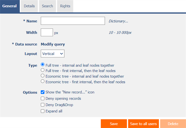
2.1. “General” tab

2.1.1. Name
- The name of the control displayed in the header of the tree structure.
2.1.2. Dictionary
- The dictionary lists the names of other controls, forms, view pages, categories, applications, and application groups used across the entire application.
- The dictionary search is used to design the correct control name and to maintain the consistency of the nomenclature throughout the application so that controls with the same meaning located in different places in the application are named in the same way.
2.1.3. Width
- The width of the control, expressed in pixels.
- If this input field is not filled in, the width of the tree structure will be determined automatically by the web browser.
2.1.4. Data source
- The data source defines the source database records displayed in a tree structure.
- Data source settings are made in the graphical designer of database queries. A detailed description of the database query designer is provided in the separate “Database Query Designer” guide.
2.1.5. Layout
- The layout determines how the tree structure is displayed, either from left to right or from top to bottom.
- The drop-down list contains the following values:
- Horizontal – displaying the tree structure from left to right
- Vertical – top-down display of the tree structure
2.1.6. Type
- The tree type determines the display range of the tree structure.
- The whole tree contains all nodes, and the subsequent showing or hiding of individual subnodes is solved using javascript.
- Power save mode shows only active nodes, and the subsequent display or hiding of individual subnodes is solved by updating the web page.
- The drop-down list contains the following values:
- Full tree – internal and leaf nodes together
- Full tree – first internal, then the leaf nodes
- Economic tree – internal and leaf nodes together
- Economic tree – first internal, then the leaf nodes
2.1.7. Options
- Show “New Record…” icon
- Checking this box determines whether an icon should be displayed in the header of the tree structure and for individual nodes, which redirects the user to a specific edit form in order to create a new record in the database.
- Deny opening records
- Checking this box determines whether all users should be denied access to the edit form to open the displayed database record using the pencil icon that appears at the beginning of each node in the tree.
- Deny Drag&Drop
- Checking this box determines whether dragging and dropping of individual nodes in the tree structure should be disabled.
- Expand all
- Checking this box determines whether the tree structure should be fully expanded, including all its nodes and subnodes, when it is displayed.
- An icon for expanding the entire tree structure is also available in the footer of each tree structure.
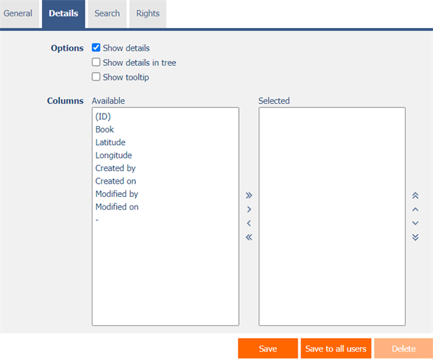
2.2. “Details” tab

2.2.1. Options
- Show details
- Checking this box determines whether the tree structure should display the details of each record to the right of the tree structure.
- Show details in tree
- Checking this box determines whether the tree structure should display the details of individual records as part of individual nodes or subnodes.
- Show tooltip
- Checking this box determines whether the tree structure should display the details of individual records in the tooltip when the mouse hovers over individual records.
2.2.2. Columns
- Definition of columns of details displayed to the right next to the tree structure in details, or when hovering the mouse over individual records of the tree structure.
2.3. “Search” tab

2.3.1. Options
- Activate search
- Checking this box determines whether a row with a search box and a “Search” button should be automatically displayed in the header of the tree structure.
- Show search results only
- Checking this box determines whether the data in the tree structure should be displayed only when filling in the values in the form referenced by the constraints of the database query of this tree structure.
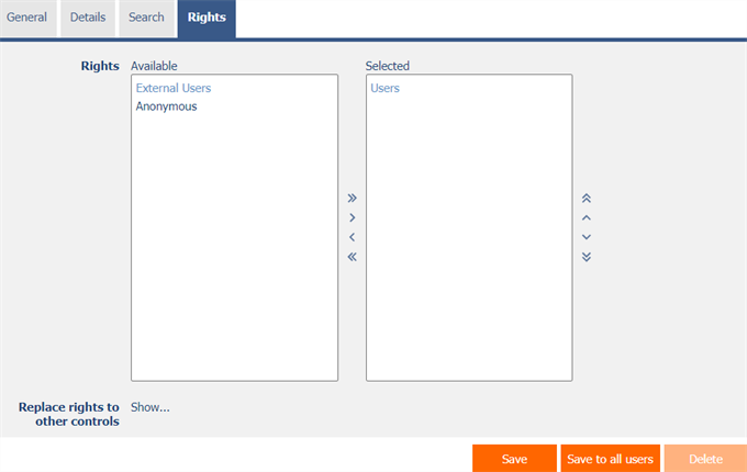
2.4. “Rights” tab

2.4.1. Rights
- Rights define a list of user groups and users who have permission to display the control on the view page.
2.4.2. Replace rights to other controls
- The “Replace rights to other controls” feature is used to unify rights across the entire view page for controls that are related in terms of rights.
- Thanks to the “Show…” link, it is possible to display a list of all controls on the view page, including the setting of the rights of these controls. For each control, a check box is displayed that allows you to select the control. When you save a control, the same rights are then set for those selected controls.
- An alternative for unifying rights within the entire view page is to display the report available from the “Subordinate object rights” tab in the view page settings.
2.5. “Administration” tab

- The “Administration” tab is only displayed for existing controls.
2.5.1. Location
- Select the view page on which the control is located.
- The drop-down list contains all view pages located in the same application.
2.6. “Save”, “Save to all users”, “Copy”, “Delete”, and “Close” buttons
- “Save” button – Saves changes to the control settings together with the individual settings of the currently logged-in user.
- The individual settings of this tree for the current user will be deleted so that, upon the next display of the tree, the default settings defined in this dialog are applied.
- Individual tree settings can be opened using the gear-icon, which is available in the icon bar in the header of every tree.
- Individual tree settings include the following options:
- Column settings in the “Details” tab of the individual tree settings
- All other users will retain their individual tree settings.
- “Save to all users” button – Deletes the individual settings of this tree for all users so that, upon the next display of the tree, the default settings defined in this dialog are applied.
- “Copy” button – Creates a new copy of the current control with identical settings, but with a newly generated unique identifier.
- “Delete” button – Permanently deletes the control.
- “Close” button – Closes the control settings dialog without saving changes.
