Manual in PDF format
1. Basic information
1.1. Description of the control
A chart is a chart with the option of defining a data source using a single aggregation query, or a chart with the option of defining a maximum of four common queries without using data aggregation.
1.2. Create a new control
The new chart can be created as follows from the preview page using the toolbar with controls:
- First, clicking on the view page determines the position in which the new chart should be placed. This will highlight the selected position with a gray horizontal line. Then just click on the “Chart” item in the toolbar of the view page, fill in the attributes of the new control in the newly opened dialog, and then save. This will insert a new charter at a pre-selected location on the view page.
- If the required position is not determined before inserting a new chart, the new chart will be inserted at the end of the view page.
1.3. Edit or delete a control
- For each existing control, a pencil icon appears to the left of the control page to change or delete the control's settings.
- Individual controls can be moved vertically on the view page using the Drag&Drop method. Moving consists of grabbing the control, preferably behind its name, and then dragging it to the desired location on the view page.
- For security reasons, it is important to have the function of moving controls enabled using the “Drag&Drop” check box located above the toolbar with controls. This field is unchecked each time you log in to the application.
2. List of tabs in the control settings dialog
- Chart A – Setting the displayed data using the first query
- Chart B – Setting the displayed data using the second query
- Chart C – Setting the displayed data using the third query
- Chart D – Setting the displayed data using the fourth query
- Other – Color and font settings
- Rights – Rights settings
- Administration – Setting other properties
2.1. “General” tab
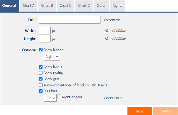
2.1.1. Title
- The name of the control displayed at the top of the chart image.
2.1.2. Dictionary
- The dictionary lists the names of other controls, forms, view pages, categories, applications, and application groups used across the entire application.
- The dictionary search is used to design the correct control name and to maintain the consistency of the nomenclature throughout the application so that controls with the same meaning located in different places in the application are named in the same way.
2.1.3. Width
- The width of the control, expressed in pixels.
- If you do not fill in this input field, the width of the chart will be set to the maximum width of the screen.
2.1.4. Height
- The height of the control, expressed in pixels.
- If you do not fill in this input field, the height of the chart will be set to 460 pixels.
- For bar charts, a height entered between 1 and 50 pixels indicates the height of one bar.
2.1.5. Options
- Show legend
- Checking this box determines whether the legend for each chart series should be displayed.
- The drop-down list contains the following values:
- Right
- Left
- Up
- Down
- Show labels
- Checking this box determines whether numeric values should be displayed in the chart.
- Show tooltip
- Checking this box determines whether the chart should display the details of individual records in the tooltip when hovering the mouse over individual values.
- Show grid
- Checking this box determines whether to display a grid highlighting the intervals of values on the X and Y axis.
- Automatic interval of labels on the X-axis
- Checking this box determines whether the X-axis label placement interval should be evaluated automatically.
- 3D Chart
- Checking this box determines whether the chart should be displayed from a perspective view, with the option to select a view angle and a rectangular perspective.
2.2. “Chart A” tab
- Definition of the first series of charts.
2.2.1. Name
- The name of the legend of the first series of the chart.
2.2.2. Data source
- The data source defines the source database records displayed in the first series of the chart.
- Data source settings are made in the graphical designer of database queries. A detailed description of the database query designer is provided in the separate “Database Query Designer” guide.
2.2.3. Y
- Select a column that specifies a value on the Y axis.
2.2.4. X
- Select a column that specifies a descriptive value on the X axis.
2.2.5. Type
- A chart type that allows you to select one of the following values:
- Column
- Stacked column
- Bar
- Stacked bar
- Line
- Spline
- Step line
- Area
- Spline area
- Stacked area
- Pie
- Doughnut
- Point
- Bubble
2.3. “Chart B” tab
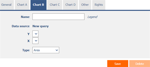
- Definition of the second series of charts.
2.4. “Chart C” tab
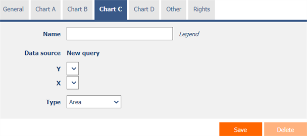
- Definition of the third series of charts.
2.5. “Chart D” tab
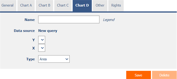
- Definition of the fourth series of charts.
2.6. “Other” tab
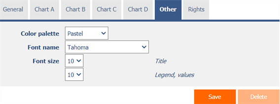
2.6.1. Color palette
- Chart color palette that allows you to select one of the following values:
- Default
- Earth colors
- Berry
- Chocolate
- Excel
- Fire
- Sea green
- Transparent
- Pastel
- Gray scale
- Light
- None
2.6.2. Font name
- The font name used to display label texts, legends, and values in the chart.
2.6.3. Font size – Title
- The text size used to display headings.
2.6.4. Font size – Legend, values
- The text size used to display legends and values in the chart.
2.7. “Rights” tab
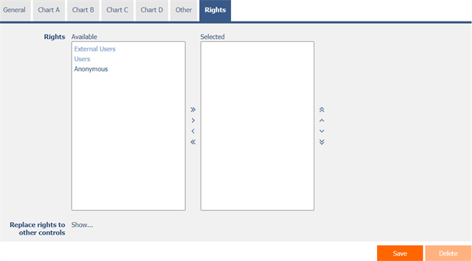
2.7.1. Rights
- Rights define a list of user groups and users who have permission to display the control on the view page.
2.7.2. Replace rights to other controls
- The “Replace rights to other controls” feature is used to unify rights across the entire view page for controls that are related in terms of rights.
- Thanks to the “Show…” link, it is possible to display a list of all controls on the view page, including the setting of the rights of these controls. For each control, a check box is displayed that allows you to select the control. When you save a control, the same rights are then set for those selected controls.
- An alternative for unifying rights within the entire view page is to display the report available from the “Subordinate object rights” tab in the view page settings.
2.8. “Administration” tab
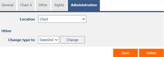
- The “Administration” tab is only displayed for existing controls.
2.8.1. Location
- Select the view page on which the control is located.
- The drop-down list contains all view pages located in the same application.
2.8.2. Change type to
- The drop-down list offers the types of controls to which conversion of the control is supported.
