1. General information
1.1. Description of the control
AutoSum is a one-line text field of any width, which is used to automatically evaluate the aggregation function on predefined data from the database. These aggregation functions include number, sum, average, maximum, and minimum. The evaluation of the aggregation function takes place immediately when opening the record in the edit form, each time the edit form is updated, before saving the record to the database in the edit form, or optionally using the server function “UPDATEAUTOSUM”.
1.2. Create a new control
A new autosum can be created as follows from the edit form using the toolbar with controls:
- First, the position in which the new autosum is to be placed is determined by clicking the mouse in the edit form. This will highlight the selected position with a gray horizontal line. Then just click on the item “AutoSum” in the toolbar of the edit form, fill in the attributes of the new control in the newly opened dialog, and then save. This will insert a new autosum to the pre-selected location of the edit form.
- If the required position is not determined before inserting a new autosum, the new autosum will be inserted at the end of the edit form.
1.3. Edit or delete a control
- For each existing control, a pencil icon appears on the left side of the edit form to change or delete the control's settings.
- Individual controls can be moved vertically in the edit form using the Drag&Drop method. Moving consists of grabbing the control, preferably behind its name located in the left column of the edit form, and then dragging it to the desired position in the edit form.
- For security reasons, it is important to have the function of moving controls enabled using the “Drag&Drop” check box located above the toolbar with controls. This field is unchecked each time you log in to the application.
- Deleting an autosum results in the irreversible deletion of the database column associated with that autosum in the database, and thus in the deletion of its values in all records in the database table.
2. List of tabs in the control settings dialog
- General – Setting general properties
- Help – Settings for help text that can be displayed on the right side of the edit form
- Filter – Setting the filter that can be displayed in the view table in the column header
- Rights – Rights settings
- Administration – Setting other properties
2.1. “General” tab
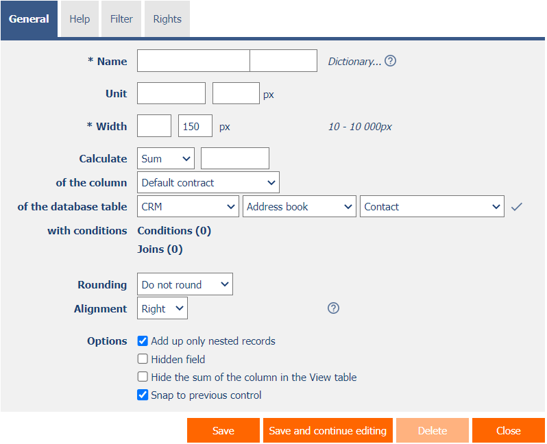
2.1.1. Name
- The name of the control displayed in the edit form in a separate column with a colored background to the left of the text box itself.
2.1.2. Abbreviated name
- Optional control name displayed in the view table header if the control is selected as one of the view table columns.
- If an abbreviated name is specified, the full name of the control is displayed in the tooltip above the abbreviated name.
- If an abbreviated name is not specified, the full name of the control is displayed in the header of the view table.
- The abbreviated name “ ” (fixed space) can completely hide the name of the control displayed in the view table.
2.1.3. Dictionary…
- The dictionary lists the names of other controls, forms, view pages, categories, applications, and application groups used across the entire application.
- The dictionary search is used to design the correct control name and to maintain the consistency of the nomenclature throughout the application so that controls with the same meaning located in different places in the application are named in the same way.
2.1.4. Unit
- The unit specifies a symbol (such as “%”) that appears everywhere in the application, along with the value of the control. The symbol is always placed to the right of the value itself, separated by a space.
- The unit may also include a decimal format that can be used to force automatic rounding of the value (for example, “{0.00}” or “{0.00}%”).
- Along with the unit, it is possible to define the width of the space designated for the unit in the edit form so as to maintain a space between the unit located to the right of the text box and the help of the control located to the right of the unit.
2.1.5. Width
- The width of the control, expressed in pixels.
2.1.6. Calculate
- The “Calculate” field specifies the aggregation function that the autosum calculates.
- The drop-down list contains the following types of aggregation functions:
- Count
- Sum
- Avergage
- MAX
- MIN
- The result of the aggregation function can be multiplied or divided, or a numeric constant can be added or subtracted to it. The input field to the right of the drop-down list is used to define this calculation, see the following examples:
- “+123”
- “-123”
- “*123”
- “/123“
2.1.7. Of the column
- Definition of the column that autosum uses to calculate the value.
2.1.8. Of the database table
- Definition of a database table that contains a column that autosum uses to calculate a value.
2.1.9. With conditions
- Definition of conditions that limit the set of data from which the resulting value is calculated.
2.1.10. Joins
- Definitions of joins that are built using the “JOIN” clause.
2.1.11. Rounding
- Definition of rounding of the calculated value.
- The drop-down list contains the following types of rounding:
- Do not round
- Round Up
- Round Down
- Whole number
- 1 decimal place
- 2 decimal places
- 3 decimal places
- 4 decimal places
- 5 decimal places
- 6 decimal places
- 7 decimal places
- 8 decimal places
2.1.12. Alignment
- Alignment determines the position of the text inside the text box itself in the edit form, and the position of the control values in the view table if the control is selected as one of the columns in the view table.
- The drop-down list contains the following types of alignment:
- Left
- Centre
- Right (default)
2.1.13. Options
- Add up only nested records
- Checking this box determines whether the resulting value should be calculated only from nested records to the currently open record in the edit form.
- Hidden field
- The hidden field setting determines whether the control should be part of an edit form, but should not be visible in user mode.
- The hidden control, including the filled value, can be found in the source code of the web page. It cannot therefore be used as part of security measures, the rights to the control are used for this.
- Hide the sum of the column in the View table
- Checking this box determines whether the sum of the control values from all filtered view table entries should be displayed in the footer of the view table.
- In order for column totals to be displayed in the view table, the view table must have column totals displayed. The default settings for displaying columns are taken directly from the properties of the view table, however, each user can change these settings themselves in their personalized settings of the view table.
- Snap to previous control
- Checking this box determines whether the control itself should be displayed to the right of the previous one in the edit form, or whether it will be displayed below the previous control in the usual way.
- If the control snaps to the previous one, you can define the offset width from the previous control
- The indent is defined in pixels in a separate text box, which is located to the left of the “Width” text box.
- Within the entire edit form, the controls are usually indented so that they are optically placed ideally in two columns or three. It is generally recommended to have as few vertical lines as possible in the form – to fit the individual controls – and thus to use a uniform width of controls that are optically placed one below the other in one column.
- The same applies to indentation, which is suitable for use with the same value for all controls that are snapped, and optically forms a separate column of the edit form.
- When designing columns for an edit form, it is recommended practice to first consider the width of the controls in the first column, and then the overall width of the second column. The first column intentionally uses the width of the controls instead of the width of the entire column, because the controls in the first column start on the same vertical line throughout the edit form, and the control names to the left of the control itself automatically allocate the width needed for that control. the longest of them. The second column of the edit form, which consists of snapped controls, must have a fixed indent that displays the names of the snapped controls. It can happen that the name of the attached control is longer than the indentation itself, which violates the design of the edit form, and the control itself jumps more to the right. To the right of the offset, therefore, follows the attached control element.
- If we remember the total width of the second column, which consists of the width of the indent and the width of the attached control, and we have already set the width of the control, it is possible to write a value in the format indent in the format “500-” to ensure that the value the offset is calculated automatically according to the formula “Offset = Total column width – Control width”.
2.2. “Help” tab

2.2.1. Help
- Help is the text displayed to the right of the control itself in the edit form. The help of all controls starts on the same vertical line in the entire edit form – they are optically placed in a separate help column.
- The display of help text differs when snapping controls.
- If “Automatic grouping” is checked in the edit form settings, a bulleted list of all help controls located in the same row will be automatically generated in the help column, with the option to click the bulleted list item and display the help text.
- If “Automatic grouping” is not checked in the edit form settings, the help for controls to the left of snapped controls is not displayed.
- Help text supports simple text formatting using wiki syntax:
- '''Bold text'''
- ''Italics''
- '''''Bold italics'''''
- ""Text enclosed in double quotes""
- Lists:
- * Heading 1
- ** Subheading 1.1
- ** Subheading 1.2
- * Heading 2
- * Heading 3
- # Numbered heading 1
- ## Numbered subheading 1.1
- ## Numbered subheading 1.2
- # Numbered heading 2
- # Numbered heading 3
- The text of the help can be displayed only after clicking on the icon with a question mark, which is located in a common place as help, only visually it takes up less space. Alternatively, abbreviated help text may appear in front of this icon. The question mark icon is defined by placing three dots at the end of the first line of help and then entering a new line (enter). The three dots may be preceded by an abbreviated help text. This is followed by help text of any length, including transitions to new lines.
- …
Help text displayed after clicking on the question mark icon - Short help text…
Help text displayed after clicking on the question mark icon
- …
- In conjunction with the question mark icon, a variant can be used in which, after clicking on the icon, the help text followed by three dots is not displayed, but on the contrary, the content of, for example, the wonder located anywhere in the edit form is displayed/hidden. On the new line after the three dots, it is necessary to specify the ID of this wonder using the javascript function “el”.
- …
el('D1') - Short help text…
el('D1')
- …
- The help radio button contains the following two types of help definitions:
- Text – help text defines a manually entered text string located in a multi-line text field below the radio button
- From query – the help text defines the result of a database query, which is evaluated when opening the edit form
2.2.2. Notes
- Notes are used to enter any text intended for the application administrator.
2.3. “Filter” tab

2.3.1. Options
- Show filter in the View table
- Checking this box determines whether the view table should be allowed to filter records by the values present in the database in the column associated with this control. The filter drop-down list is located in the header of the view table under the name of the control.
- Allow multiple changes
- Checking this box determines whether the “Assign value…” item should be available in the filter drop-down list, which is used to assign a value to all filtered records in the view table.
- Selecting this item opens a new window displaying the control associated with the filtered column. Using the “Save” button, you can then change the column value for all filtered records in the view table to the selected value. In order for the “Assign value…” item to appear in the filter drop-down list, the view table must have bulk data changes enabled.
2.3.2. Records per page
- The number of records per page determines the maximum number of unique values that appear in the filter based on the analysis of the read data in the view table in the column associated with the filter. If there are more occurrences of unique values in the data than the defined number of records on the page, the analysis of unique values in the given column will be interrupted, and the item “Load values…” will be displayed in the filter. All unique values in the given column and read data in the view table.
- The view table itself can read a large amount of data, or the filtered column can contain a large number of unique values, which affects the speed of compiling a list of these values. In cases where it is not important to analyze the values at all when generating the look-up table, and it is sufficient to use the function “Load values…”, it is advisable to set the number of records on the page to the value “0”.
2.4. “Rights” tab

2.4.1. Rights
- Rights define a list of user groups and users who have permission to display a control on an edit form and to display the values of that control elsewhere in the application.
- Users who do not have control rights
- they do not see the control or its value in the edit form, nor can they find it in the source code of the page in a web browser,
- they cannot display the column associated with this control in a view table or other visual control intended for viewing data.
- they can create an entry in the edit form in which there is a control to which they do not have rights, the value of these controls is then set to the database value “null”,
- they cannot delete any record in an edit form in which there is a control to which they do not have rights.
- An application administrator can cause a logical error when a javascript function refers to a control that may not be accessible from a rights perspective for some users. The variable “ng_” is then replaced by the value stored in the database in this control instead of a reference to the object of the control itself. In most cases, this error stops loading the edit form, it disables itself, and the user is shown a message that he should contact the application administrator. This type of error can be partially eliminated using the report “Controls (JavaScript + insufficient rights)”.
2.4.2. Show value
- The display of the control value can be limited only to the users who created the database record, or are set as co-owners of all records in the edit form settings.
- The radio button contains the following types of value display:
- To all users – the control, including its value, will be displayed to all users who have the right to the control
- Only to the owner or co-owner of the record – the control, including its value, will be displayed only to users who have the right to the control and at the same time are the owners of the currently open database record in the edit form (created the record) or are set as co-owners of all records in the edit form settings.
2.4.3. Replace rights to other controls
- The “Replace rights to other controls” function is used to unify the rights within the entire edit form for controls that are related in terms of rights.
- Thanks to the “Show…” link, it is possible to display a list of all controls in the edit form, including setting the rights of these controls. For each control, a check box is displayed that allows you to select the control. When you save a control, the same rights are then set for those selected controls.
- An alternative for unifying rights within the entire edit form is to display the report available from the “Subordinate object rights” tab in the edit form settings.
2.5. “Administration” tab

The “Administration” tab is only displayed for existing controls.
2.5.1. Identifier
- The identifier specifies the name of the database column in which the values entered through the control in the edit form are stored in the database.
- The identifier is derived from the name of the control. It starts with the prefix “ng_”, and also contains the alphanumeric characters used in the control name (system controls do not include the prefix “ng_”). When changing the name of the control, the “Correct” button is available, which is used to correct the identifier, and thus to rename the database column in the database. For clarity and to eliminate possible misunderstandings, it is recommended to keep the identifier in accordance with the name of the control element. If external applications also access the database and, for example, read or write data to this column, it is necessary to schedule the change of the identifier until a suitable time.
2.5.2. Full identifier
- The full identifier of the control also contains the identifier of the edit form, and is used in printing templates.
2.5.3. Index
- Checking this box determines whether the column associated with this control should be indexed in the database. In the text field located below the check box, it is also possible to define the names (identifiers) of other columns that are to be in the associated index with this database column – they should be part of the index key.
- For the MSSQL database, it is also possible to define “INCLUDE” columns to be attached to the index. However, they are not part of the index key, but the values of that key. The Firebird database does not allow this functionality.
2.5.4. Search in the View table
- The search determines whether records in the view table should be searched using the “equals” operator after entering a search term or phrase in the database in the column associated with this control.
- Deny – Searching in this column is disabled, and there is no check box in the view table to include the table column in the list of columns to be searched.
- Allow – Searching in this column is enabled, and a check box appears in the view table, which allows you to include the table column in the list of searched columns.
2.5.5. Other
- Change type to
- The drop-down list offers the types of controls to which conversion of the control is supported, including automatic conversion of the data present in the database table.
2.5.6. Statistics
- Statistics display aggregated information about control usage across the entire application.
- Using the “Statistics” button, a detailed report of all places where the control is used or referenced is displayed, including the possibility to open the settings of such a place or control.
- Before each change of control type or data type, or before each deletion of a control from the edit form, it is recommended to thoroughly go through the control statistics, and eliminate any misunderstandings.
- Before each deletion of the control from the edit form, the evaluation of the statistics starts automatically. If the control is used or referenced somewhere in the application, it is necessary to confirm the deletion of the control again.
3. Examples
3.1. Javascript functions
3.1.1. General functions
- var s = control_GetValue(#ng_#);
- var n = jsN(control_GetValue(#ng_#));
- var n = jsN(#ng_#.value);
3.1.2. Integers
- var s = jsNumberInWords(12345678, 'cs');
3.1.3. Decimal numbers
- var s = jsNumberInWords(12345.678, 'cs');
- var s = jsFormatDouble(1100.5412, 'kg');
3.1.4. Currencies
- var s = jsNumberInWords(12345.678, 'cs');
- var s = jsFormatCurrency(1100.5412, 'CZK');
3.2. Server functions
3.2.1. General functions
- UPDATEAUTOSUM(id, form)
- UPDATEAUTOSUM(1;2;3, form)
3.2.2. Integers
- SUBSTRACTINTEGERS(10, 1)
3.2.3. Decimal numbers
- COMPAREDOUBLE(1, <, 2, Ano, Ne)
- FORMATDOUBLE(1000)
- FORMATDOUBLE(1000, EUR)
3.2.4. Currencies
- FORMATCURRENCY(1000)
- FORMATCURRENCY(1000, EUR)